Pantone color of the year 2020 is revealed. The beginning of the new decade is off to a calming start with Pantone 19-4052 Classic Blue. The exclusive Pantone Matching System of the company is used in a variety of industries such as painting, graphic design, fashion, home and interiors.
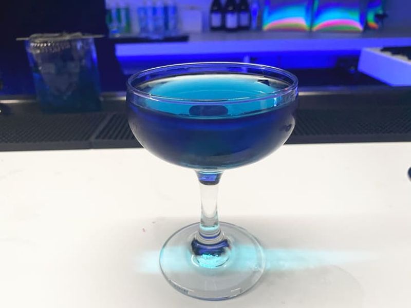
The beautiful hue bestows a sense of peace and tranquility to the human spirit. Expectantly, Classic Blue color will dominate every aspect of coming months and years. Interiors, fashion, accessories, furniture, even beverages too, all will be draped in the calming tinges of this dusky blue. Classic Blue will beautifully accent the interiors of your home or workplace.
Classic Blue encourages us to look beyond the obvious to expand our thinking; challenging us to think more deeply, increase our perspective and open the flow of communication,
Leatrice Eiseman, executive director of the Pantone Color Institute, said in a statement.
The reason behind the choice is the instilling quality of the color that invokes calm, confidence, and connection. A timeless hue, Pantone 19-4052 Classic Blue is an elegant color that is suggestive of the sky at twilight. The thought-provoking Classic Blue highlights the desire for a stable foundation as the new era starts.
Pantone’s tradition of naming a color of the year began more than two decades ago. The Pantone Color Institute felt the need of introducing a calming shade which would be a representative of the spirit of the age. Therefore, it settled on a shade that offers the reassurance, confidence and connection that people may be searching for in an uncertain global milieu.
The Pantone Color Institute spends the year scouring the globe — from the runway to current events, technology trends and more — to find shades that are influencing society to choose its Color of the Year.
Via: CNN
Follow Homecrux on Google News!

