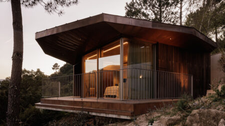
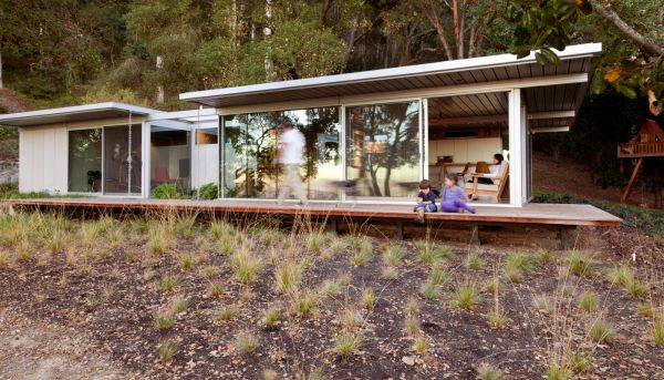
Quality meets efficiency – this in a nutshell dictates the design language of the itHouse by Taalman Koch. Conceived as a small house with easy glass facades, the constructional process entailed the assembling of pre-fabricated components from an off site. The process made sure that the individual sections met the high standards of engineering, while also putting minimal strain on the actual site of the house. This endeavor is directly related to the spatial essence of the house, which thrives to create a visual as well as psychological relationship of the user to the surrounding delicate landscape.
Now, beyond quality aspects, it is the role of energy efficiency that decides the carbon footprint of the conception. And, we daresay that itHouse passed out with flying colors in the ‘green’ department. Utilizing components like high-efficiency appliances, radiant floor heating and solar panels, the design crucially cuts back on its carbon emissions. The ambit is further improved by usage of other architectural techniques like building orientation, natural ventilation and even passive heating and cooling.
Finally, coming to the scope of circulation, all of these glass facades may lead us to believe that the open planned itHouse lacks privacy. However, the designers have made sure to endow the user’s their personal space by integrating special graphic design behind the glass walls. Created by artists such as Sarah Morris and Liam Gillick, these custom designs visually segregate the spaces for various functions like sun-shades, framed views and most importantly privacy zones.
All images are courtesy of Art Gray and Patricia Parinejad.
Follow Homecrux on Google News!

