Being a journalist and a thespian for the better part of a decade, I’ve seen almost everything under the sun. My profession allows me to meet multiple people from varying fields, while some are random conversations, some leave a lasting impression. The twenty-odd minute conversation with Pantone’s Executive Director Leatrice Eiseman was spellbinding. It felt like I was back in high school with a lecturer smoking philosophy; I sat awestruck and eyes glued on her expressions and ears wide open to her oration.
Eiseman began the conversation guffawing a little (probably because of my naive question to begin with), and then told me, “I don’t call myself a ‘Color Guru,’ it’s a very complimentary expression that people come up with.”
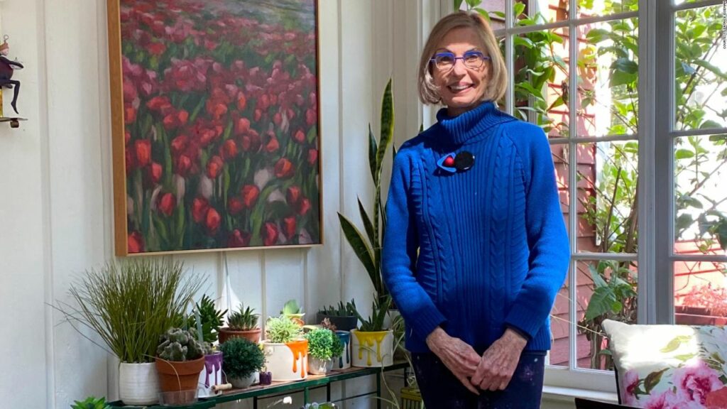
Before Pantone’s director got on board for an exclusive interview, I knew Eiseman had a knack for color and also had a sense of fashion incorporated within her colorist image. It was no surprise then that her (virtual) presence left me impressed. She elegantly carried a red shrug (sweater) that matched the spectacle frame. Sitting in a room full of books, (some of which she has written herself) Eiseman looked like a professor eluding in-depth understanding of color and its conundrum.
“What a colorist like myself does is to help people arrive at the correct choices for colors, whether it be in the interior or the exterior, commercial or residential, or whether it be for a product in development, all of this is very important to have some expertise in because the color is a huge influence in what people will buy,” Eiseman said.
As an international color specialist, Eiseman’s job revolves around assisting companies in their color choice in a range of areas including packaging, logos, and interior design. “There is an aesthetic aspect of color so companies want colors that people regard as attractive,” she informed.

Eiseman is the executive director of the Pantone Color Institute, a division of Pantone, and has been holding the charge for more than thirty years now. Speaking on her work experience with the organization, Eiseman stated, “When I started out all those years ago, there were many people who just didn’t understand how important color was in the marketplace. In the beginning, it was a matter of educating people, and I think what has happened over years is that more and more people have recognized and acknowledged the importance of color.”
“Now when I talk about color and do color consulting, there are fewer people who say, what a color consultant does. More people have developed the understanding of the importance of color,” she cheerfully stated.
Eiseman holds a degree in psychology from Antioch University and a counseling certificate from UCLA. Being well-versed in business administration, Eiseman has even studied and taught in the fields of fashion and interior design.
“It’s important to have an amalgamation of varying verticals,” she stated. “What I have done is conduct a lot of research on consumer acceptance of color, what is it that they respond to, the psychology of color is very important, the essential meaning of a color and how people will respond and react to it,” she noted. The American color specialist also emphasized the cultural aspect of the color since a particular color may have a specific meaning in a culture.
Eiseman spoke on color trends and forecasts; since companies make products for the long run and want a color that sails throughout. “Color trends are important in order to look like you are up to date and knowledgeable about what is the mood that is involved in the color,” she stated.
As an allied member of the Industrial Designers Society of America and the Fashion Group International, Eiseman has received a prestigious service award from the Color Marketing Group. She is the spearhead of Pantone when it comes to selecting the Color of the Year. She also has a deep involvement in selecting the ten top fashion colors for Women’s Wear Daily and has authored over ten books on color.
Peach Fuzz has been announced as Pantone’s 2024 Color of the Year. “We wanted to turn to a color that could focus on the importance of community and coming together with others. The color we selected to be our Pantone Color of the Year 2024 needed to express our desire to want to be close to those we love and the joy we get when allowing ourselves to tune into who we are and just savor a moment of quiet time alone. It needed to be a color whose warm and welcoming embrace conveyed a message of compassion and empathy. One that was nurturing and whose cozy sensibility brought people together and elicited a feeling of tactility” states the company.

Subtly sensual, PANTONE 13-1023 Peach Fuzz is a heartfelt peach hue bringing a feeling of kindness and tenderness, communicating a message of caring and sharing, community and collaboration. A warm and cozy shade highlighting our desire for togetherness with others

How do you arrive at a conclusion when deciding the color of the year, what is the process behind it; I asked her. “The process starts within a year before. We have an essence of what color we might be going for. During the year, we look at the overall feeling and the encouragement that comes from the color,” she explained.
Then follows the other part, where the color expert takes notice of what’s happing in different fields across the world. “What are we gathering from the conversation, seeing online also formulates the decision making,” she added.
“In addition to that we have to do a lot of homework on what is happening in the world of art, technology, sports, and fashion. What color is an artist gravitating to is also taken into account,” she informed.
Fashion and the cosmetic industry, in particular, are very well-versed in the importance of color and Pantone keeps a close tab on what’s going on in these sectors. Pantone also looks at the world of entertainment because movies that are streamed across the globe have a huge influence as well. “There are millions of people who watch films and gravitate to the colors being shown on the big screen. We do not just look at the films of today but what is coming out next year,” she stressed.

While I was blathering at places, it was kind of her to answer every single question with utmost honesty and grace. The color specialist told me that there are people within the color industry whose opinions she respects and takes into consideration.
During the conversation, I noticed Leatrice Eiseman become a teenybopper when she recalled her childhood and transformed into an erudite professor when talking about colors. When I brought her childhood into the dialogue, a grin appeared on her face. Eiseman informed, “I always had an affinity for choosing a color.”
With children, it is really important to have the affirmation of adults around them who recognize what their talents are. Elaborating, the color specialist said, “Fortunately, I always had a mom and a dad and an aunt who were very influential in helping me get along with my career. They understood I had this eye for color and they encouraged it.” Eiseman had the luxury of choosing colors in her room which made the young color aficionado express herself.
“It is very important to encourage children to use color because colors are a wonderful way of expressing yourself,” she confirmed.
When I asked Eiseman about her favorite color, she burst out laughing. Acknowledging the question she then stated, “As a colorist, I can’t have a favorite color. I have to be super objective about the color because when people (brands) ask for advice, it’s a natural inclination to use that favorite color. So you have to divorce your personal self from private. Even in my home, I have used different colors because each one expresses a different emotion,” she concludes.
I’d like to thank Leatrice Eiseman for taking time out of her busy schedule and wish her more success and good health.
Follow Homecrux on Google News!


