Dwell has found a minimalist prefab home for their next month’s cover edition, and it’s their own creation. While we both might be competitors in our content niche, we can’t undermine Dwell’s contribution to mainstreaming home design news, to every household, and screens of your smartphones.
The American-based company has carried the bandwagon of architecture and design on its shoulders for decades and also shaped a whole new generation of writers and editors. Bridging the gap between design professionals and enthusiasts, the magazine has now officially unveiled Dwell house, a prefab accessory dwelling unit (ADU).
To those who are not familiar with ADUs, they are additional living quarters on single-family lots and are independent of the primary dwelling unit. This is not the first time Dwell has dipped its toes in house manufacturing. Earlier in 2004, it was involved with a similar project. However, it is the first time that the magazine would be offering one for sale.
Talking to Gear Patrol, Dwell current Editor-in-Chief, William Hanley reflected on the idea of a magazine diving into the field of home design. Hanley states, “In our editorial coverage, we highlight great ideas that meet present needs and anticipate the future of where and how we live. It’s critical that we not only cover that but also make it a reality.”
Drifting our focus back to the house, it is to be noted that Dwell joined hands with Silicon Valley-based prefab builder Abodu and the Danish firm Norm Architects to design the 540-square-feet dwelling unit which is up for grabs at $389,000.
Norm is responsible for the minute detailing of the house from well-placed windows to built-in storage. The home is designed to be functional, not flashy, and features a spacious living space that plays well in any backyard. Abodu, on the other hand, is responsible for the technical execution and engineering of the project.
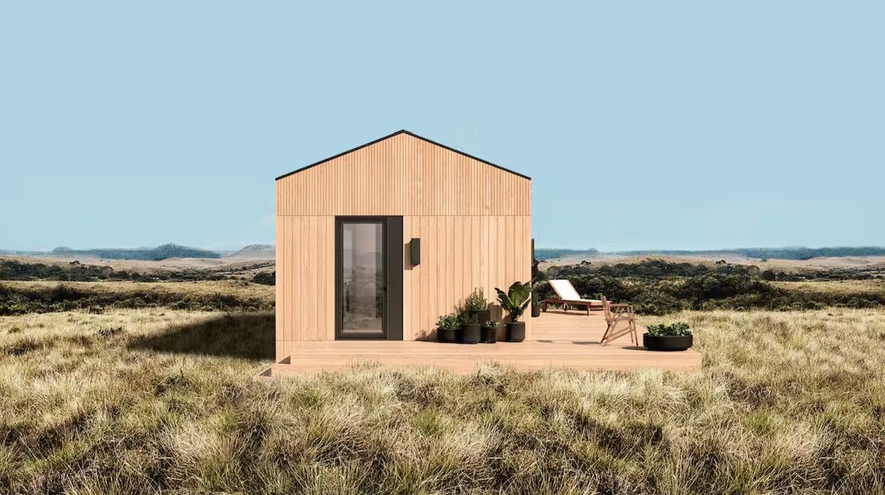
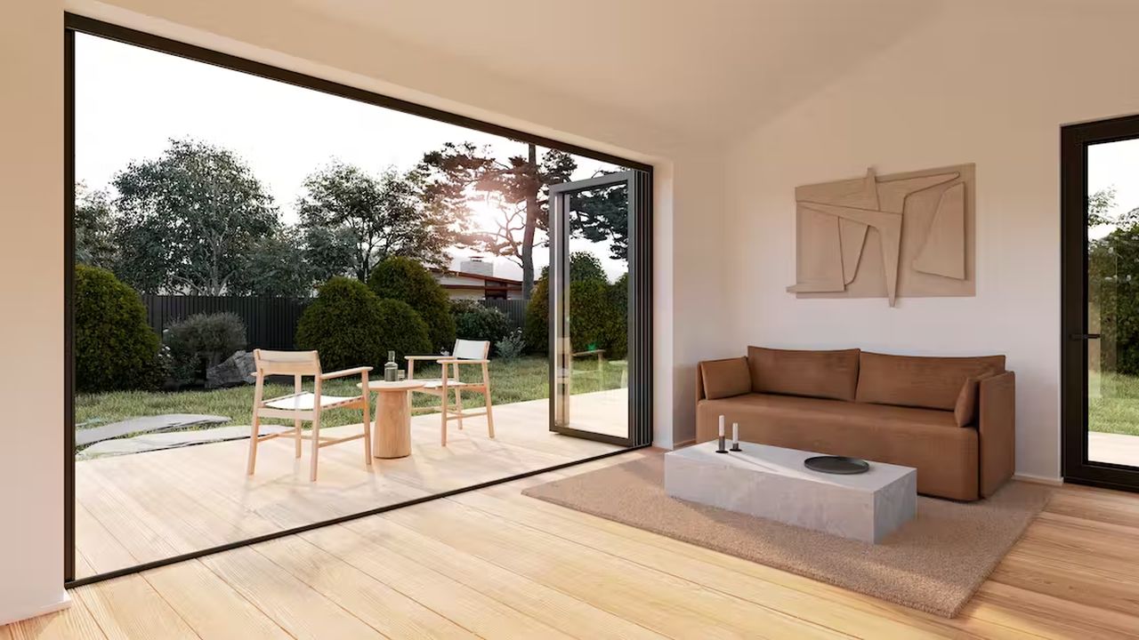
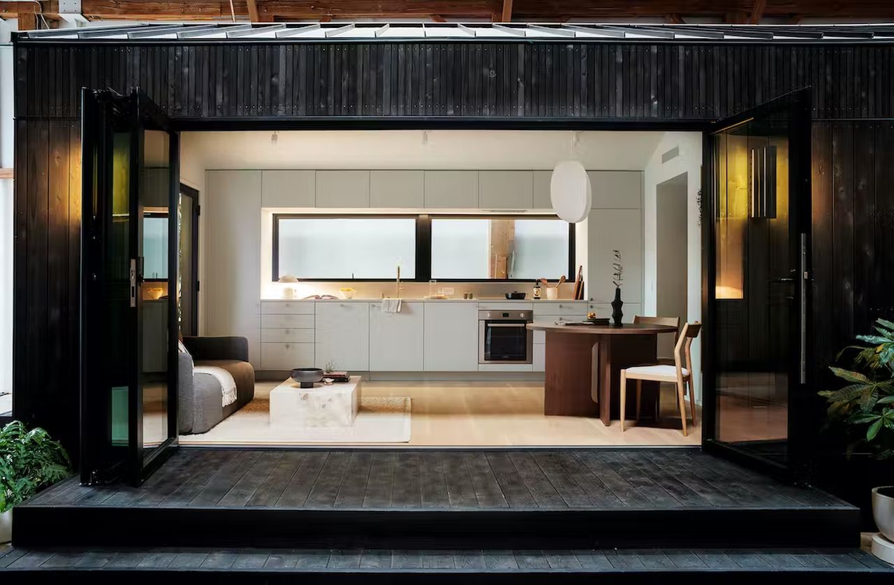
The house features an aluminum roof, oak floor, cedar siding, wraparound deck and integrated lighting, and an extra side entry that are key essentials of the beautiful house. There is a bedroom, a kitchen, a living room, and a bathroom, all outfitted with cabinets and countertops, appliances, and lighting to make the Dwell house bright and comfortable to stay in. It boasts a 12-inch folding glass wall that allows natural light to pass in and also creates an indoor-outdoor living space. The beautiful glass wall seamlessly connects outdoors with the minimal interior.
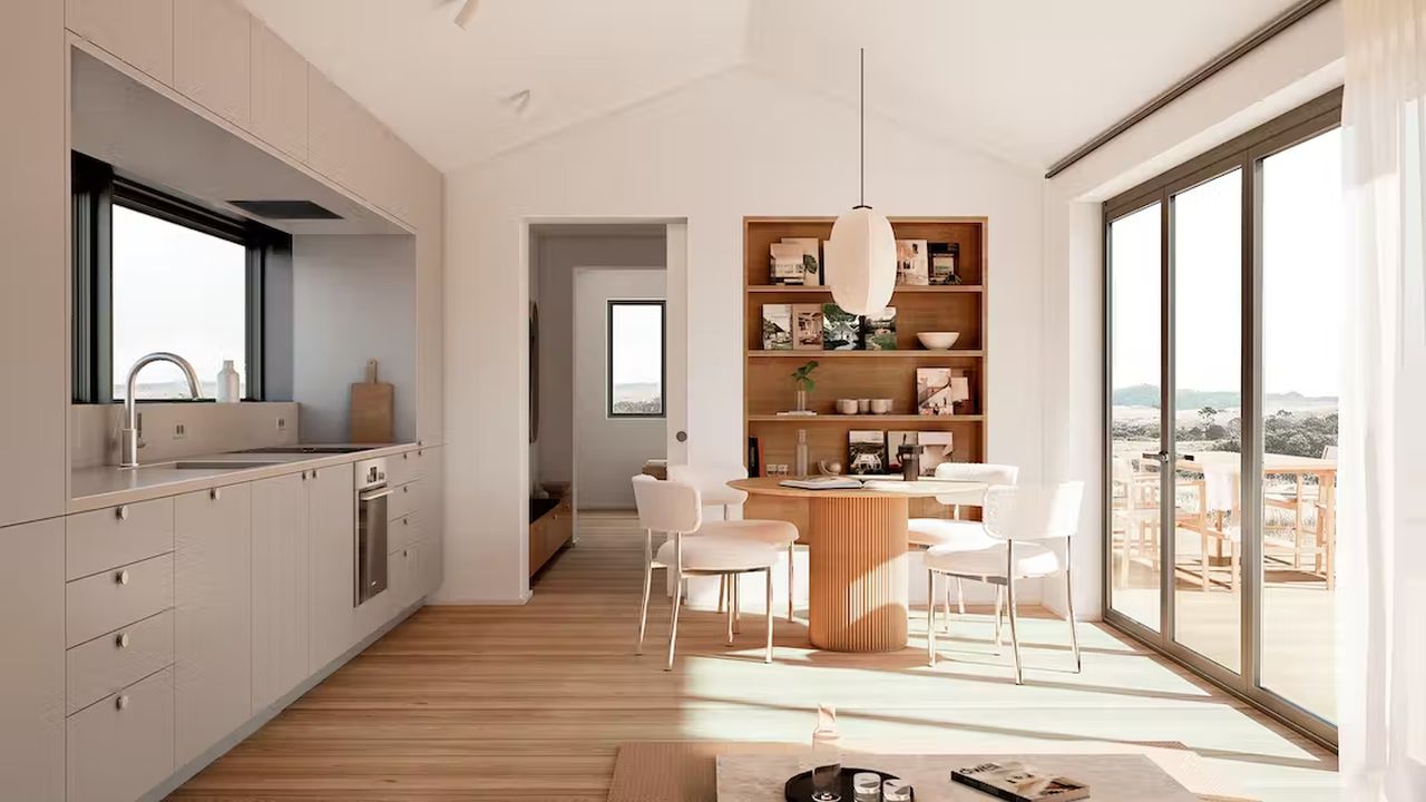
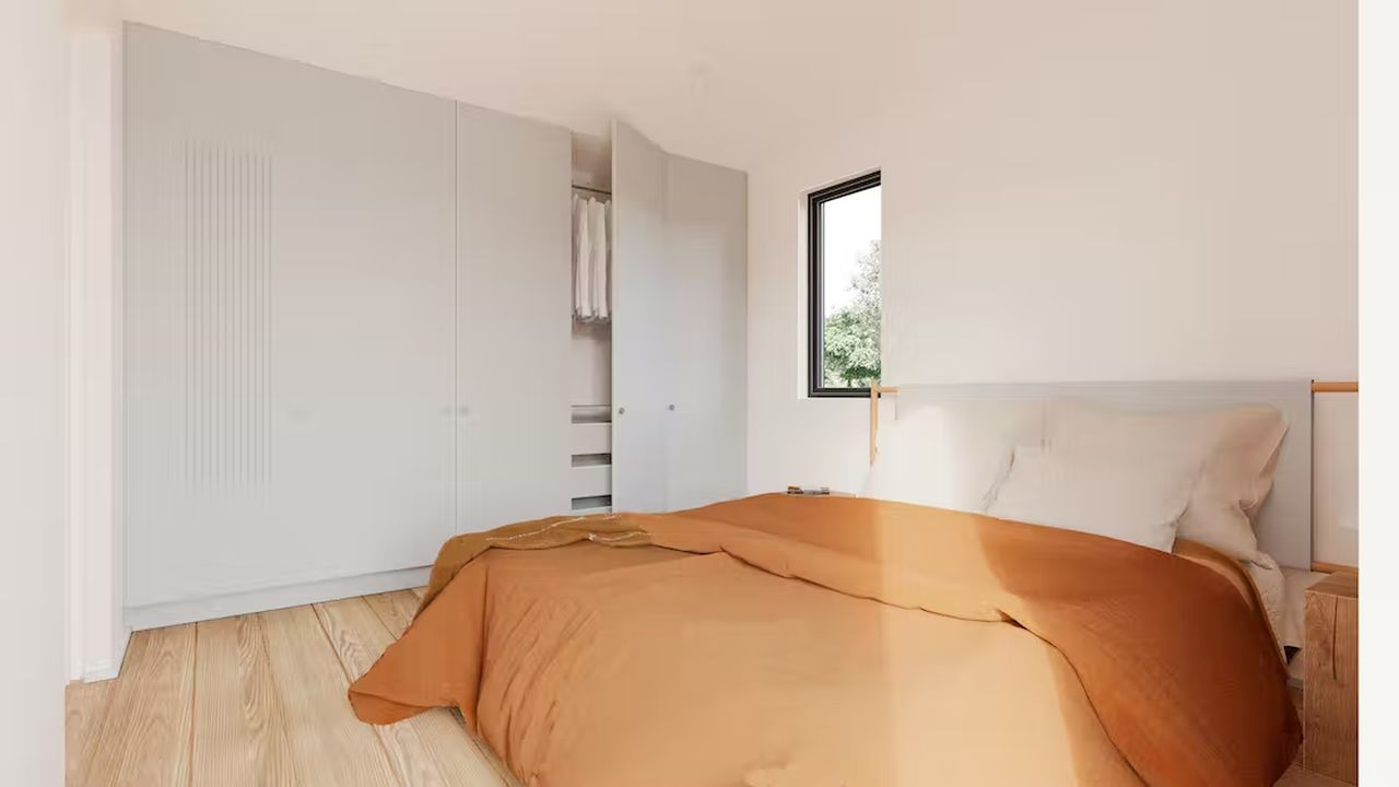
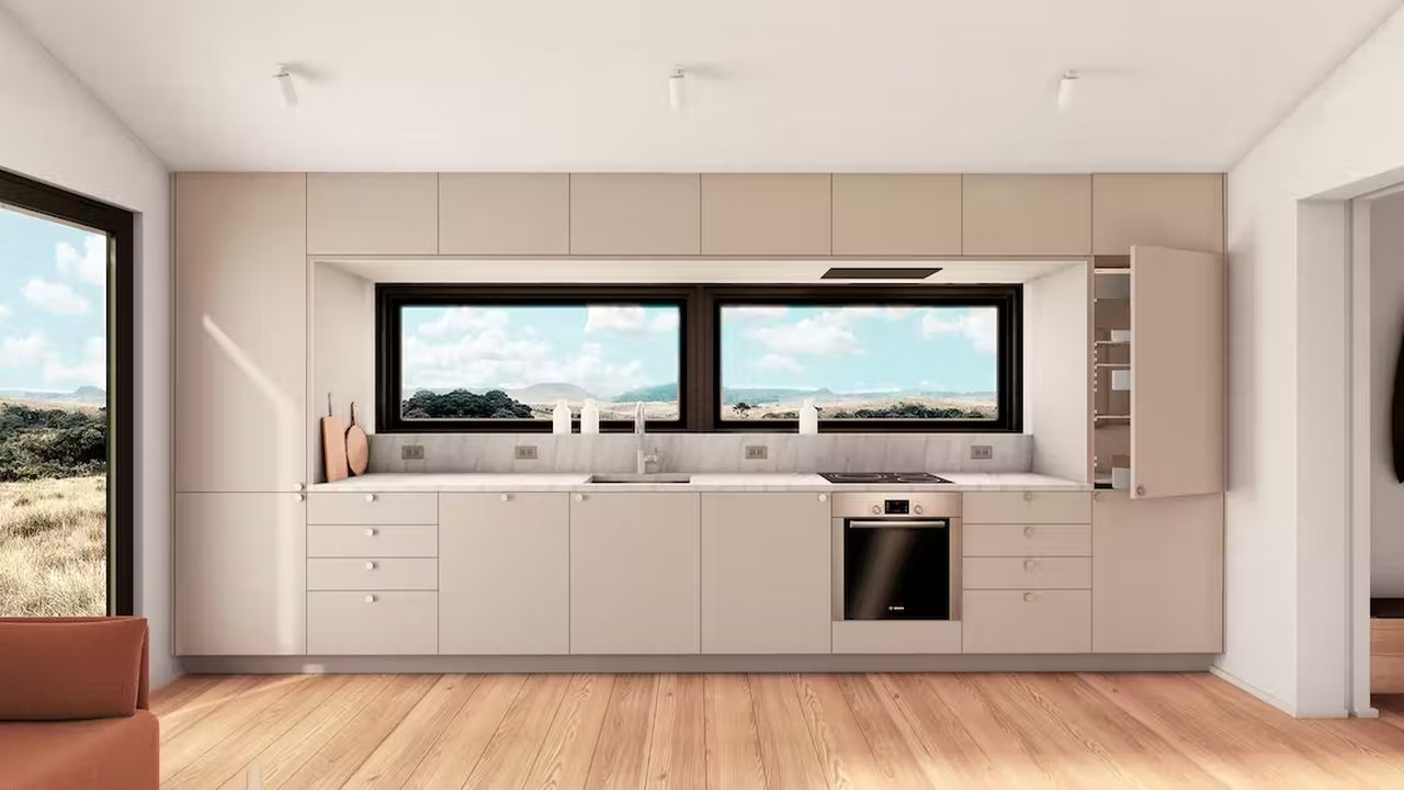
The house features a spacious living area with a sofa and a table, and built-in shelves to house your clothes and other accessories. The kitchen lies adjacent to the living and is equipped with every big to small essential required for a comfortable stay. Packed with appliances from Bosch, the kitchen also includes an oven, a refrigerator, a dishwasher, and an optional washer and dryer.
Also Read: Feature-Packed Microhaus is Affordable, Portable, and High on Luxury
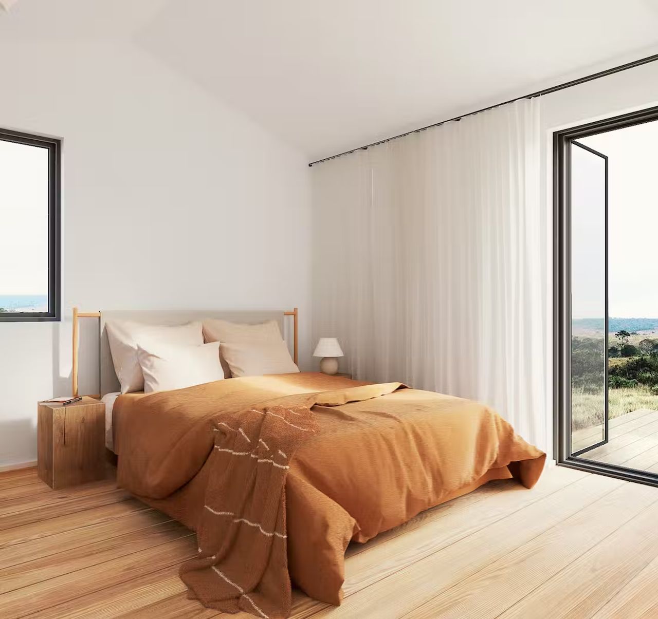
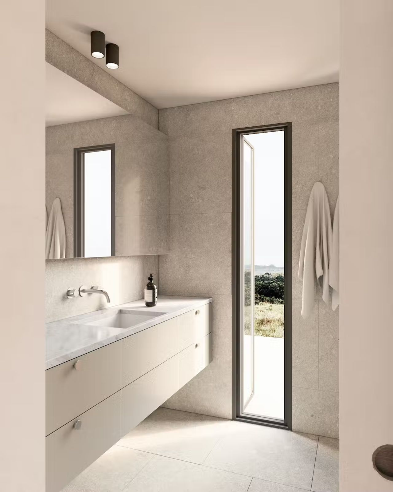
The bathroom and bedroom lie close to each other, with both parading tall windows leading to the deck outside. Featuring wraparound tiling, the bathroom is fully-equipped with a shower and plenty of storage and counter space. The bedroom has a double bed and windows on two sides.
With all these features, Dwell house has indeed turned out to be a beautiful experiment for the American magazine. Even if it’s a PR strategy, nobody can deny that constructing a home off-site and transporting a 540-square-feet, one-bedroom home unit to the user’s desired location requires a lot of guts and effort.
Follow Homecrux on Google News!

