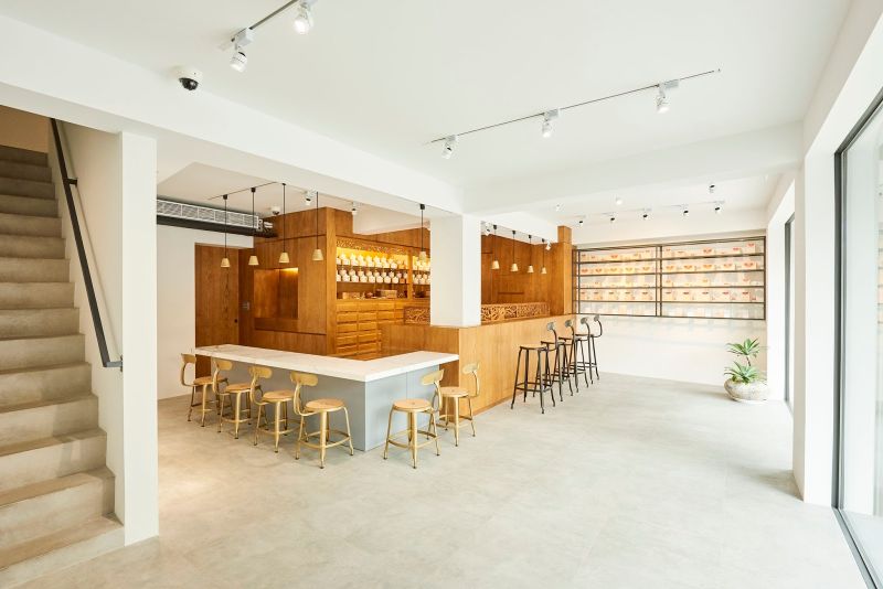
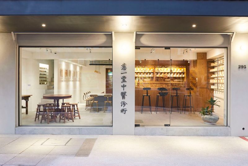
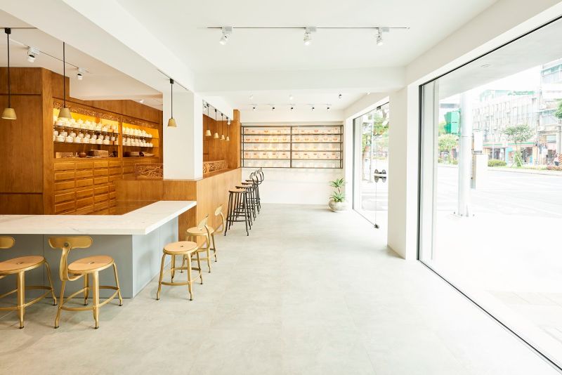
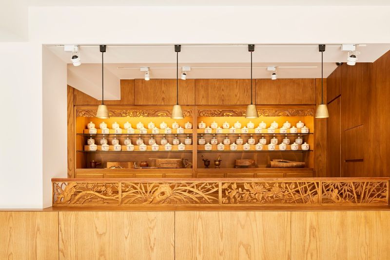
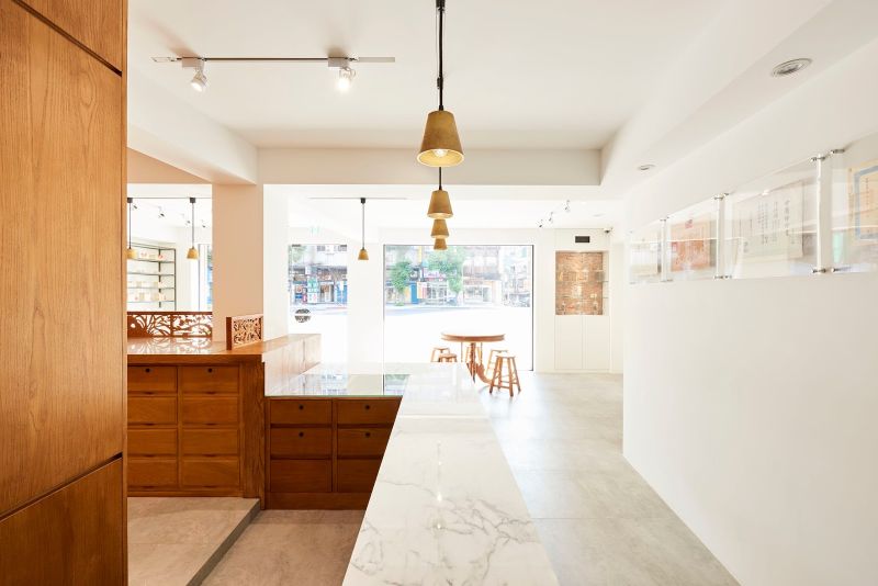
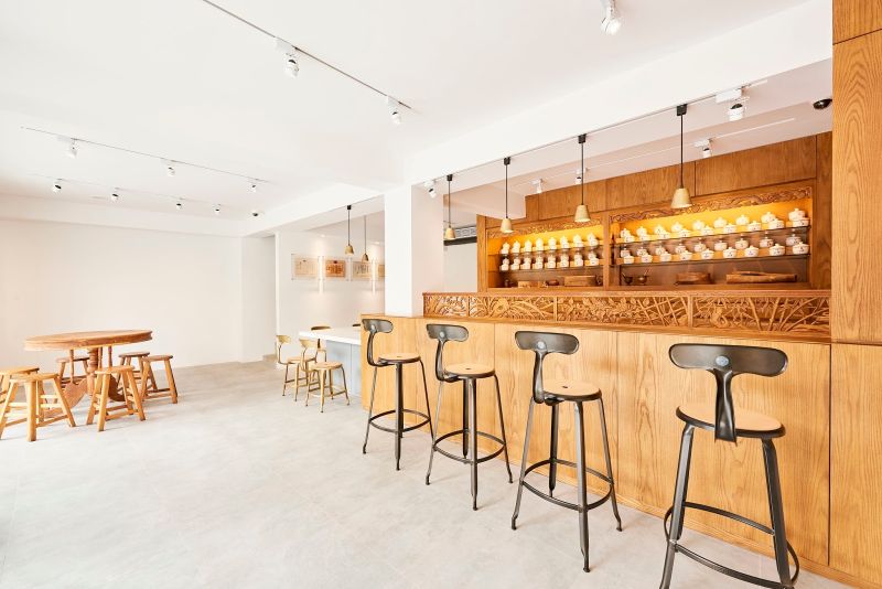
When planning to renovate homes or any space, one always thinks of adding new details without changing the older structure completely. This way the space remains familiar for the owner and people who have visited there previously. Following the same perception, Moyadesign, a Tokyo-based design studio has refurbished an old oriental pharmacy and clinic building in Taipei. Its traditional grace was kept unchanged, although several modern details were added to make it a refined architecture for all its customers, whether existing or new. The renovated clinic features floor to ceiling glass façade and antique wooden shelving behind the traditional counter.
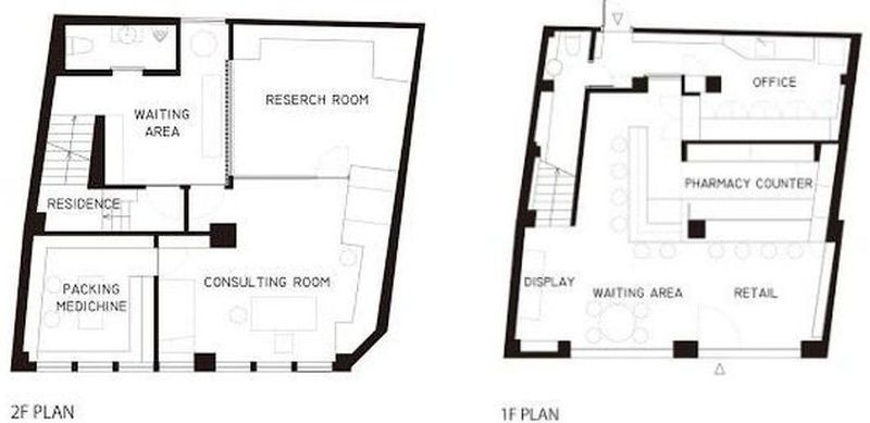
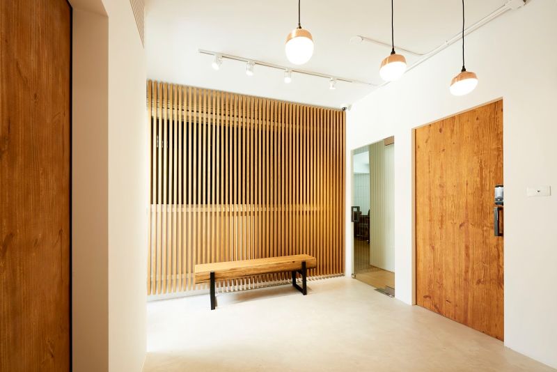
Catching more visitors through its ideal location, clinic’s first floor serves as pharmacy and waiting area, whereas the second floor is designed as a consulting room. Its light-accented walls in combination with long eaves represents the inner space tranquilly and suits well with the wooden details such as shelving, furniture and counter. As customers move inside, its simple and sophisticating interiors display the traditional pharmacy in a modern perspective.
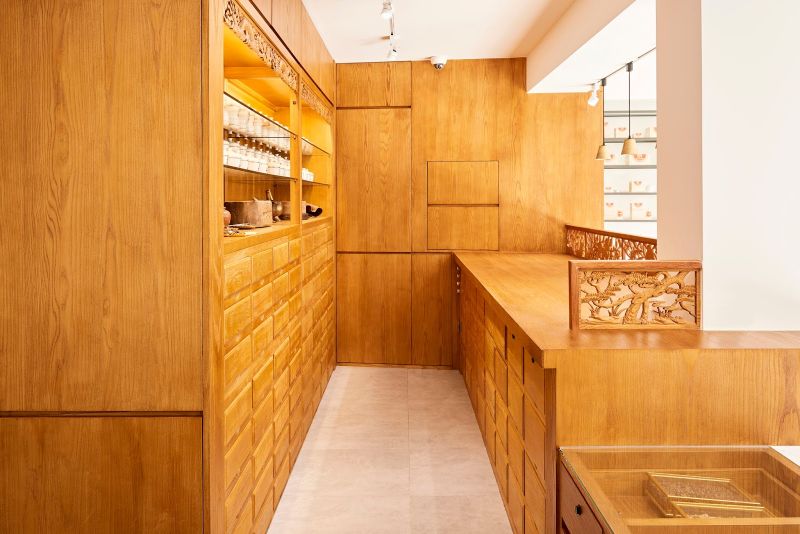
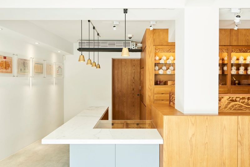
Its overall structure is kept same although the whole clinic area is renovated. The traditional wooden counter in front of the wooden shelving for medicines welcome customers as they discuss their health conditions with the pharmacist to get prescriptions. In order the pharmacist allots them medicines that are kept in several drawers of the wooden shelving unit to depict traditional pharmacy settings inside. While renovating the clinic, Moyadesign kept position of the counter and shelving unchanged to keep the space familiar to existing customers.
To maintain hospitality and show concern for customers, a long white marble table for having tea or soup is included in the clinic. The design studio also suggested to reveal a new impression of the clinic by changing logos in packaging and shelving. After visualizing the whole design, it can be said that the architecture in this clinic shows how to renovate any space without tarnishing its old appearance and interior arrangements.
Via: DesignBoom
Follow Homecrux on Google News!
